Do NBA Teams Still Pay for Draft Pedigree?
Four years into a career, the NBA still pays for draft night. Top four picks earn about 5% of the salary cap above what their production explains.

If you leaned towards Center A, or thought it was too close to call, you reached the same conclusion as a model that never knew where either player was drafted.
The NBA did something very different.
Both players hit restricted free agency without securing rookie extensions. Yet the contracts they ultimately received were anything but similar. Deandre Ayton signed for 25% of the salary cap. Jarrett Allen signed for 17.8%. How could two players who play the same position and have similar production over their rookie contracts be valued so differently?
One comparison proves nothing. But it raises an important question: after four years of NBA evidence, are teams still paying for what a player has become– or for where he was drafted?
To answer that question, we need more than an anecdote. We need a way to estimate what every player should have been paid if draft position were hidden from the market, and only production were measured. So that's exactly what I built.
How Do We Isolate Draft Pedigree from Production?
Top draft picks are supposed to be better, and so it makes sense that Ayton would be paid more than Allen, right? If on average the higher picks are paid more, that should just be evidence of the draft working. Pick and production are tangled together, so the challenge is separating the two.
To accomplish this, I built a simple pricing model using every first-round pick from 2014 through the 2020 draft classes. Out of all the first-round players in those drafts, 185 logged at least one measured season (500 minutes) during their rookie contract. Not every player lasted four years, and 25 never signed a second contract at all. Those 25 stay in the sample with the salary the market gave them: nothing. Dropping them would skew the comparison toward survivors, since the players who wash out are concentrated well outside the podium.
The model only sees two pieces of information from each player's rookie contract:
- Impact: minutes weighted xRAPM across Years 1-4.
- Opportunity: total minutes played across Years 1-4.
It never sees draft position.
Note, minutes a player plays are partly a consequence of draft pedigree. The top picks get opportunity that later picks have to earn, and so the model is already crediting top picks for some of what their draft position brought them. Whatever premium falls out of this is a floor, not a ceiling.
The model then estimates what each player would be expected to earn on his second contract, expressed as a percentage of the salary cap (I looked at the greater of Year 5 or 6 for the actual cap hit). This becomes a player's production-expected pay.
The model is a simple linear regression:
Pay=β0+β1(xRAPM)+β2(Minutes₁₀₀₀)
When fitted to the sample, it produces:
Expected Pay = 0.934 + 1.898(xRAPM) + 2.179(Minutes₁₀₀₀)
Every point of xRAPM is worth roughly 1.9% of the salary cap, while every additional 1,000 minutes played is worth about 2.2%. In other words, the model is rewarding both how well a player performs and how much he actually plays. Together those inputs explain a little over 62% of the variation in second contract pay.
Once every player has an expected salary, the rest is straightforward. If a player's actual contract exceeds his production-expected pay, the difference is his premium. If he signs for less, he carries a discount. That difference is pay the model can't explain through production alone. It could reflect injury, market dynamics, or even draft pedigree.
The question is whether those premiums and discounts show up evenly across the draft board, or whether they accumulate somewhere specific?
What Happens When We Hide the Draft?
If the market priced players solely on production, we would see these premiums and discounts distributed randomly across the draft. Top picks and late first rounders alike would be just as likely to sign above or below their production-expected pay.
But that's not what the data shows.
The Premium is Concentrated at the Top
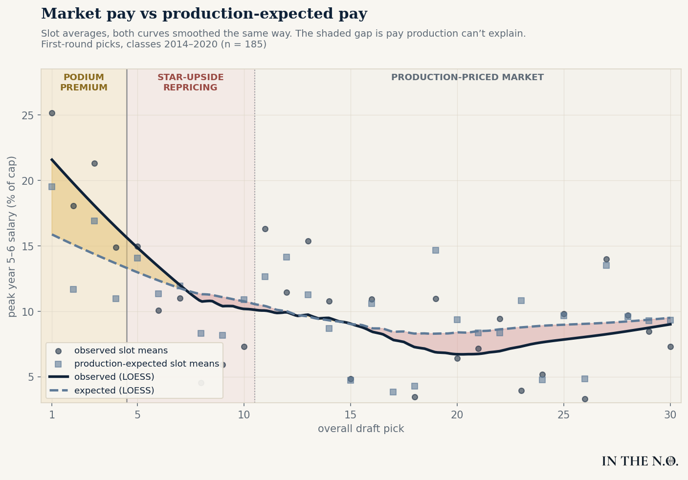
This chart compares what players were actually paid with what the model expected them to earn. The solid curve represents the actual market while the dashed curve is the production-expected pay.
At the very top of the draft, these two curves are nowhere near each other. The market consistently pays the highest picks more than production would predict.
As we approach the fifth pick, the gap dwindles rapidly. Over the next several selections, this relationship briefly reverses. Contracts track slightly below production-expected pay, before settling into a market where salary and production largely move together.
The draft premium is not scattered randomly across the first round. It is concentrated at the very top. After that, contracts increasingly reflect what players have actually produced.
Of course, the above chart summarizes players into draft-slot averages. What happens when every individual player is examined separately?
The Pattern Survives at the Player Level
The residual chart strips the averages away. Each dot represents one of the 185 players, plotted by where he was drafted and how far his actual contract landed from his blind valuation. The gold dots are players who signed above their production-expected pay and the red dots are players who signed below. The line that goes through them is a LOESS smoother – a method that imposes no global shape and simply follows the data wherever it leads. The shaded ribbon surrounding it shows the uncertainty.
Following this curve left to right tells the same story as the slot averages, only now every player is visible. Within the podium, the gold dots dominate and the trend sits well above zero. The evidence continues to build that these players consistently receive contracts above their production-expected pay.
Around the fifth pick, the shaded uncertainty ribbon crosses zero for the first time. From there and through the rest of the first round, the curve and ribbon drift modestly but still hover around zero. Just like with the slot averages, the residuals fluctuate around fair pay rather than around a persistent premium. Whatever premium exists is concentrated at the very top of the draft.
Two things become clearer at the individual level than in the slot averages. First, the podium premium is not universal. Red dots still appear among the top picks. Being drafted at the top doesn't guarantee a premium, but it does make one more likely.
Second, the scatter is enormous. Individual players routinely finish five, even ten percentage points of the cap away from their production-expected pay for reasons the model can't observe: injuries, contract timing, or a desperate front office. That's the noise. The signal is that the noise is centered near zero almost everywhere on the draft board except one place.
It's important to be careful about what this figure does, and does not prove. Curves drawn through the data are descriptive, not inferential. A smoother will always find some shape, and the human eye is remarkably good at finding patterns. The same caution applies to the labeled regions in the first chart. Those bands are labels I drew to help tell the story, not boundaries the data chose.
The real question is whether the top-heavy structure is actually supported by the data, or just an artifact of the smoother. To answer that, we need to let the statistics choose the boundaries themselves.
Is the Podium Real?
Up to this point, the boundaries in the figures have been descriptive. They help tell the story, but they don't prove where the real splits are. So instead of drawing the lines by eye, I let the data choose them.
I tested models with no breakpoints, one breakpoint, and two breakpoints, searching every possible location across the first round. I then compared those models using the Bayesian Information Criterion (BIC), which rewards models that fit the data well while penalizing unnecessary complexity. A boundary survives only if the improvement in fit is worth the added complexity.
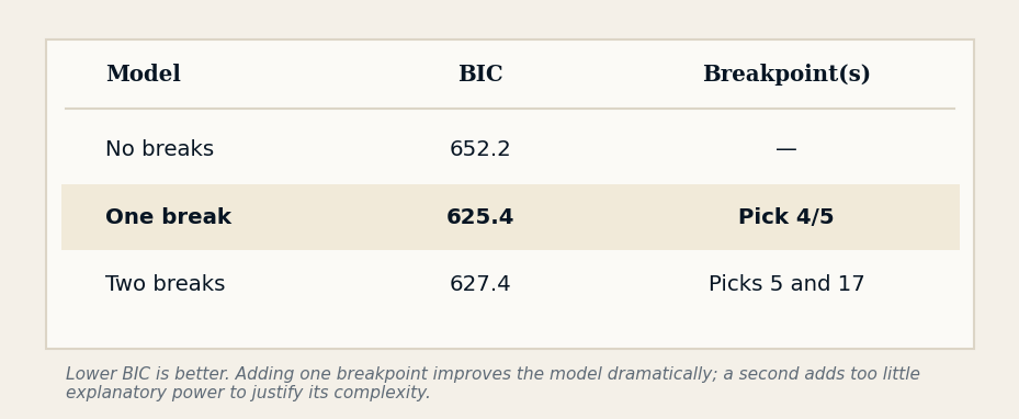
The search produced a remarkably stable answer. Repeating the entire procedure across 400 bootstrap resamples placed the optimal breakpoint between Picks 4 and 6 in 90% of samples, with the overwhelming majority landing at Pick 4 or 5. Even the two-break model kept that boundary, it just added a second one near pick 17 that doesn't improve the fit.
Picks 1-4 receive an average premium of +5.1% of the salary cap (t = +5.3). By construction, because the residuals across the entire sample sum to zero, the remaining picks average out to -0.9%. The graphs above suggested the market changes at the edge of the podium and this breakpoint search reaches the same conclusion independently.
Put differently, the simple production model explains about 62% of second contract pay. Adding a single piece of information – whether a player went top four – pushes that to 68%. A simple fact from draft night accounts for six percentage points of pay four years later that production cannot.
A Step Beats a Curve
The breakpoint analysis identified a step model with one clear market boundary. But that conclusion shouldn't depend on a single statistical model. If the podium premium is real, different modeling approaches should converge on the same answer – including the smooth curves traditionally used in draft analysis.
So I estimated the same relationship four different ways.
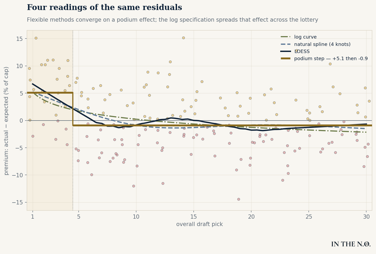
The figure above overlays four different ways of modeling the exact same player-level residuals. The green dashed curve is the traditional logarithmic specification. The blue dashed line is a flexible natural spline, free to bend wherever the data leads it. The dark navy line is the LOESS smoother from the residual premium chart. Finally the gold line is the piecewise step selected by the breakpoint search.
The LOESS smoother, the natural spline, and the breakpoint model all follow the same qualitative pattern. They concentrate the premium within the first few picks before flattening into a production-priced market. The logarithmic model is the lone exception, forcing the premium to decline smoothly across much of the lottery.
The visual convergence is reassuring, but I wanted to compare how well each specification actually fits the data.
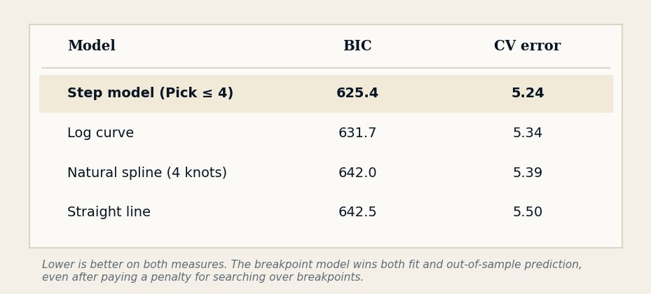
The breakpoint model produced the lowest BIC while also delivering the best out-of-sample prediction. The improvement in predictive accuracy over the logarithmic specification is modest, but the breakpoint model consistently provides the best overall description of the data.
The comparison also highlights an important distinction. While the spline bends towards the same podium pattern, it provides little improvement in overall fit relative to a simple linear trend. Only the breakpoint model captures enough additional structure to justify the added complexity. Taken together, the evidence suggests that the market prices a distinct podium premium rather than a gradually declining draft effect.
What Does This Mean?
While the evidence is strong enough to suggest that teams pay a premium on the second contracts for top four picks, it has not shown that teams are always wrong to do so. This is a distinction that I feel is important to make.
Top picks are selected on their franchise changing upside, and that same star upside doesn't always reveal itself in four years. Front offices are routinely betting that as players age into the prime of their careers, their production will catch up and even exceed their salary.
Take, for example, Jaren Jackson Jr. Memphis extended Jackson to a four-year, $104.7 million deal after a third season in which he appeared in just 11 games. On production alone, the extension looked aggressive. Two years later, Jackson was an All-Star, Defensive Player of the Year, and the contract quickly became one of the league's best values.
In fact, the Jackson example highlights an important point about team behavior. Podium picks are often extended before their fourth year, and some of their measured premium reflects teams paying before the final year of evidence rather than in spite of it.
Being the completionist that I am, I refit everything on Years 1-3 only, to simulate the information teams would have going into an extension decision. The podium premium still revealed itself to be +5.4% of the cap (t = +4.7), and the breakpoint search still lands at the edge of the podium. If anything, with only three years of information, the premium is marginally larger than four years of information.
This makes sense since teams are buying on potential with the rookie extension. Jackson's premium actually grew to +13.4% when evaluated on what Memphis actually knew at the time of extension.
But that doesn't mean every premium is justified. We began this article with Deandre Ayton and Jarrett Allen because the comparison raises an important question, not because it settles one. Individual negotiations are messy. Injuries, leverage, cap environments, and organizational priorities all matter. Ayton had a great finals run, while Allen did nothing of note in the playoffs. Yet once those stories are aggregated across 185 players, the same pattern keeps appearing. Teams are paying roughly 5% of the salary cap above what production merits at the very top of the draft.
For front offices, the lesson isn't to stop paying elite prospects. It's to recognize when you're paying for projection rather than production. That premium may be a rational investment in superstar upside, but it should be evaluated carefully and not assumed. Especially when restricted free agency is such a powerful tool for teams.
Just as importantly, the premium disappears outside the podium. From Pick 5 onward, contracts are overwhelmingly explained by production. This creates opportunities to acquire talented players without paying for their draft pedigree. Brooklyn drafted Jarrett Allen with the 22nd pick. When it came time for Cleveland to retain him, production, not pedigree, was the biggest driver in that second contract. They were able to secure him at 17.8% of the cap for comparable production to the number one overall pick, who cost Phoenix 25% one season later.
The NBA may keep paying for draft pedigree at the top of the board. The real opportunities lie everywhere else.